Project Overview
Our objective is to develop a platform that connects solo travelers on their own terms while also limiting solo travel loneliness. This platform is important because many solo travelers find making meaningful connections difficult while traveling. Travolo makes that process less stressful.
Audience
The majority of Travolo’s users are millennials! Millennials grew up alongside technology, they understand and embrace forming connections online. Millennials also lead in solo travel!
Although research shows the majority of users will be millennials we envision Travolo’s users being individuals of all ages, ethnicities, genders, socio-economic classes, and creeds. Travolo hopes to foster an environment that is warm and inviting for all!
Project Goals
1) Develop a safe and stress free way to connect solo travelers.
2) Design a simple and intuitive experience for users.
The Process
Empathize
I began by conducting secondary research in order to empathize with solo travelers and develop a well rounded understanding of solo travel. Then I conducted primary research in the form of interviews. These interviews educated me on the motivations, needs, and pain points felt by solo travelers.
“I definitely believe safety is a big concern, especially while you’re traveling and you’re still young. And I believe that, of course, gender comes into play.”
-V
“Those times when I would feel lonely, I honestly would just be like, okay, it’s time to look at the map! Where can I go? That looks interesting, or just like, walk down a random street or whatever, and see where it took me.” -C
Define
With the insights obtained from my research I conducted a thematic analysis. I identified 3 recurring themes; safety, emotional recognition, and coping mechanisms. The dissection of these themes helped me narrow down my potential users, their pain points, behaviors, and attitudes. With this information I created personas to represent the needs and goals of solo travelers. Let me introduce you to our users, Meaghan and Anthony!
Personas of potential users
Jobs-To-Be-Done (JTBD)
To understand solo travelers goals I reviewed all insights I acquired up until this point and synthesized JTBD statements. One thing I learned from this exercise is that solo travelers are deeply invested in the immersion and exploration of new cultures. I decided that Travolo needed to provide users with the resources and confidence to accomplish this!
Festival in Mexico
Problem Statements
The final step in the defining state was synthesizing “How might we“ statements. These statements brought to light the pain points felt by solo travelers. This exercise got me thinking of all the possible solutions to these pain points.
Ideate
User Flows
Finally! Time to put pen to paper and bring my thoughts to life! I created user flows that lay out the step by step process users will take to complete the 2 red routes identified. This will also guide me later on when I start creating individual wireframes.
Competitive Analysis
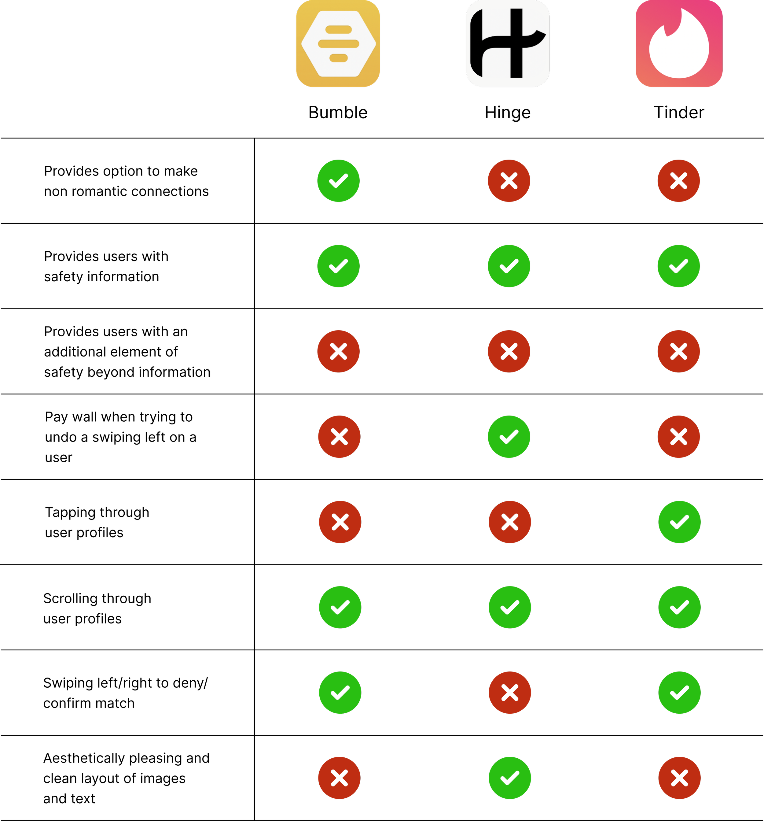
I then conducted a competitive analysis of the top 3 apps on the market that provide a platform to form connections online. I evaluated elements of their user interface and design to create the list below. This analysis helped me realize where Travolo could fill in the blanks and also inspired my future design.
Hand Sketching
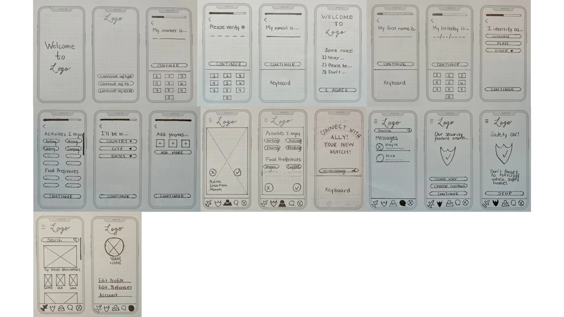
Quick!! Get the paper and pencil! I was beyond excited to begin getting my ideas on paper, I started by sketching wireframes for the sign up process, profile search, safety feature, and more. Sketching helped me release every thought I had bottled up and brought my initial product concept to life.
Style Guide
With a few sketches on hand my next step was to decide on colors, icons, typography, and more! I have to admit this process was difficult for me. I knew I wanted blue as my primary color because of the psychology surrounding it. But beyond that I had no clue! I had to do a lot of research on color/color combination and eventually came up with the style guide you see below.
High Fidelity Wireframes
This is when it all started to take form! I took my style guide and applied it to the low fidelity wireframes I had developed and the result is what you see below! I finally had a product to show after all my hard work!
Prototyping
Once the wireframes were complete I began prototyping. It was exciting to see Travolo come to life and to be able to play around with the app for the first time.
Image of the prototyping process
Testing
Moderated Usability Testing (Round 1)
Round one of testing brought to light many issues in the current design, below are the 3 main issues identified and the redesign that addressed them.
Participants did not understand the safety feature’s purpose and function. I redesigned the screen with a blue information icon, once clicked it will provide users with a detailed description of the feature.
There was reluctancy by participants about meeting up with users. The redesign incorporates additional safety features. Users can now block and report users, and there is now a feature that provides contact information for local authorities.
Participants were confused why the photos of the user’s profile were not of the same person. They also thought the Lorem Ipsum was a different language and were thrown off. I created a consistent profile with images of the same person and answered the profile prompts in english to eliminate any confusion.
Moderated Usability Testing (Round 2)
After redesigning I conducted round two of testing. The main issues this round were:
Confusion caused by the toggle on the initial safety screen.
Participants wanting a blurb on the initial profile photo.
More graphics on the profile’s activities page for increased visually attraction.
Limited text on the additional safety information screen.
Conclusion
Here is the final version of the Travolo app in action!
Challenges
1. Designing a cohesive interface for familiar and unfamiliar users.
2. Creating an app that revolves around safely connecting users.
3. Creating a simple flow that is easy to understand and navigate by all users.
4. The limited resources and capabilities of a one person team.
Outcomes & Lessons
Yayy! I have completed my first UX project! Going through a project from idea conception to completion was truly a rewarding experience. I was able to experience and learn about many of the processes design teams tackle in order to reach their goals. Here is what I learned:
Research is key! Research helped me in every aspect of this project. I gained so much knowledge during primary and secondary research, but also from conducting research continuously through out. Research helped me get this project past the finish line.
The power of discovery from usability testing. I couldn’t believe how much I learned during usability testing and how much I overlooked or didn’t even think of while designing. This process was enlightening and helped elevate my design.
Iterate often. Iteration helps keep the creativity juices flowing! There are many solutions to a problem and it is important to keep iterating until you find one that best fits your needs. Not to mention if you iterate often you will suppress the desire of wanting to start over when something does not work as intended.
UI is a learnable skill, even though it doesn’t always feel like it! I often felt stuck and like I was reinventing the wheel when it came to UI. Until I realized that it was not necessary to pick my brain until I had that one stroke of genius, if it ever came. Inspiration can come from all over, what’s important is research and pulling bits and pieces of what you like and making it your own.
THANK YOU!
Thank you for taking the time to visit and review my very first project! As this is my debut UX endeavor, your engagement holds significant value to me. I appreciate the time you've taken out of your schedule to look at it. Please feel free to reach out if you have any questions or would like to discuss further.


