Project Overview
The young music streaming start up Melodious is ready to take the next step and offer their dedicated user base and future users a Premium experience! Melodious has requested the opportunity for new users to subscribe to Premium upon account registration and for current users to learn of and have the ability to upgrade.
The Process
Documentation Review
It was important to begin by reviewing documentation provided by Melodious. I was able to learn Melodious’s goals and information about their target audience.
Empathize
After reading the information provided by Melodious I went on to conduct my own secondary research on the target audience, Gen Zers between 18 and 24 y.o., and subscription services.
Define
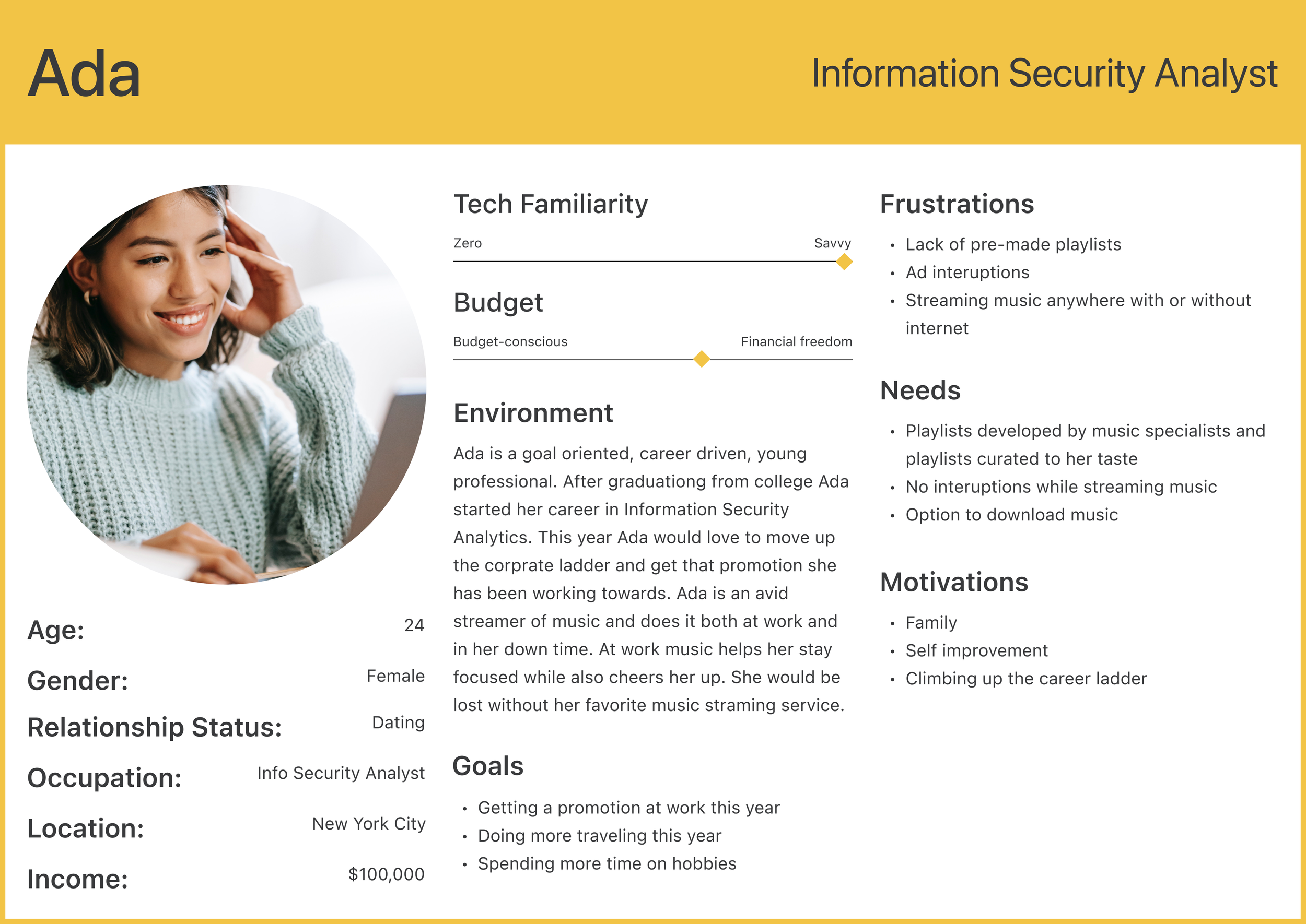
After documentation review and further research I went on to synthesize what I learned in the form of personas. This was important so that I had users in mind when beginning the design process. Let me introduce you to Ada and Mac!
Style Guide
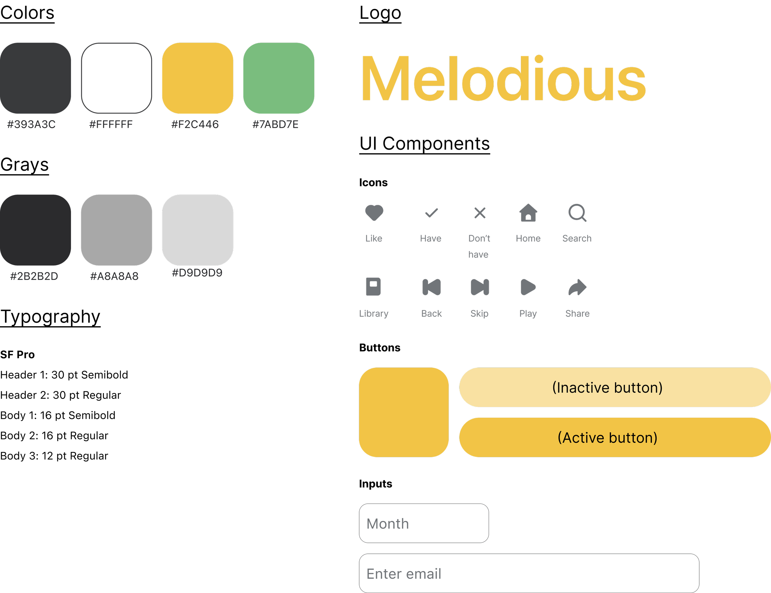
Now that I had a better understanding of the Melodious user I went on to create a style guide that I felt best represented the target users personality.
Ideate
User Flows
Time to bring my ideas to life! To begin I created user flows that lay out the step by step process that new and existing users will take to upgrade to premium. These user maps will also act as a guide later on when I start creating individual wireframes.
Competitive Analysis
I then conducted a competitive analysis of 5 companies that provide premium streaming services. I evaluated elements of their user interface, design, sign up process and upgrade process to create the chart below. This analysis helped me realize where Melodious could fill in the blanks.
N/A refers information I did not have access to without an account.
Lo-Fi Wireframes
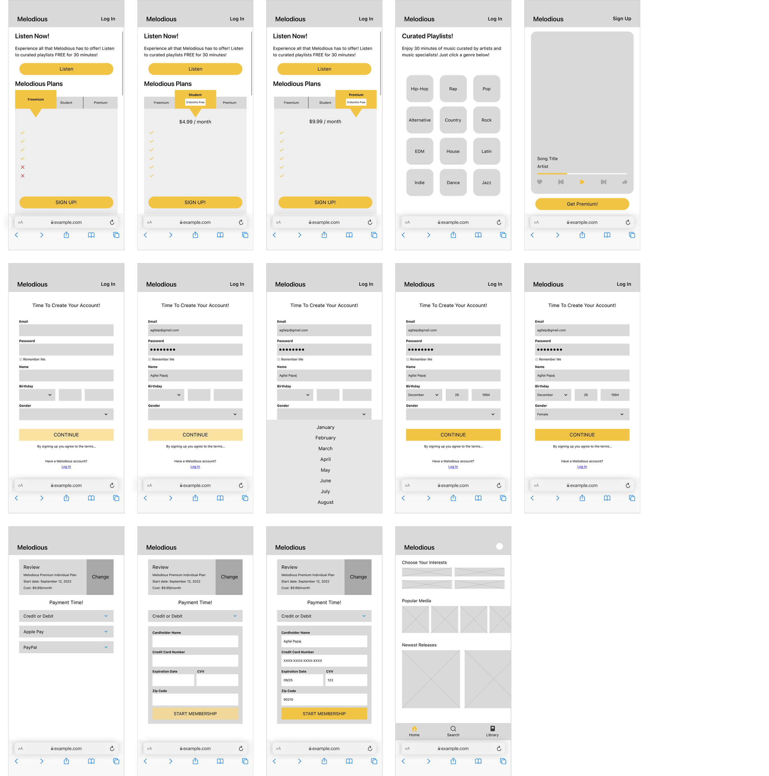
Finally my ideas are coming to life! Below you can see the low fidelity wireframes I developed. I designed screens for both new and returning Melodious users.
New Melodious Users:
Returning Melodious Users:
Hi-Fi Wireframes
During this step I referred back to the style guide I previously created and applied it to the low fidelity wireframes I developed.
New Melodious Users:
Returning Melodious Users:
Prototyping
Once the high fidelity wireframes were complete I began prototyping. It was exciting to see Melodious come to life and to be able to play around with the mobile website for the first time!
Image of the prototyping process
Testing
Moderated Usability Testing (Round 1)
Round one of testing brought to light many issues in the design, below are the 2 main problems identified and the redesign that addressed them.
The first issue participants came across
was in regards to the curated playlist.
When choosing a genre participants
verbalized choosing multiple options to
listen to. Initially my intention was that
users would choose one genre and then
listen to that. I redesigned the screens to make multiple selection possible. This is represented by a green circle with a number appearing on the selected genres.
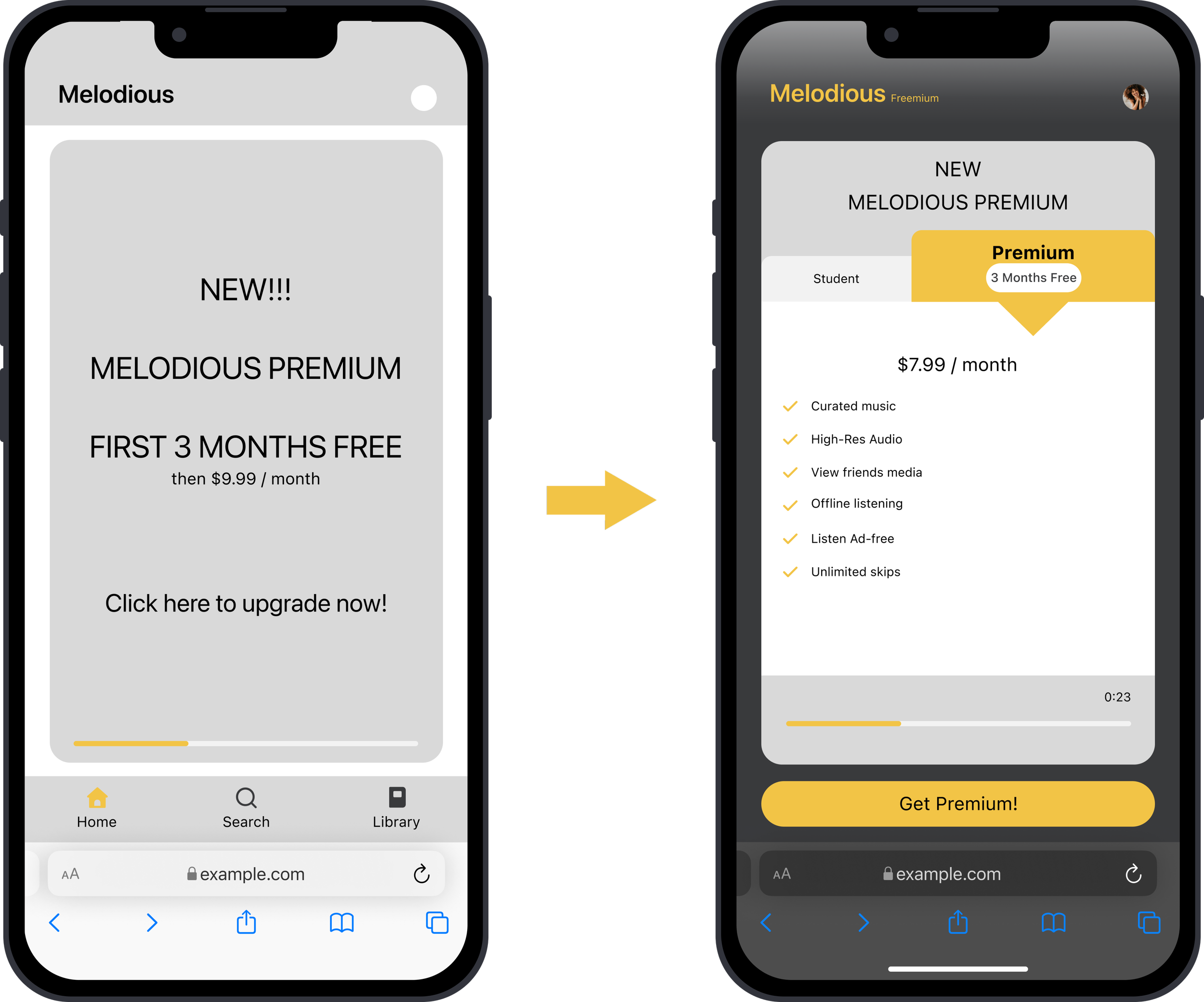
Participants suggested there be a
separate CTA for upgrading on the ad
screen. Initially I thought that it would
be easier for users if the whole ad
was a clickable CTA. When testing
users suggested some differentiation
between the ad and the upgrade CTA. I redesigned the screen with separate CTA and an interactive ad that featured both student and premium upgrade plans.
Moderated Usability Testing (Round 2)
The main issue that came up this round
was in regards to the “Skip This Step”
CTA on the payment page. I thought it
was important to have an option for
users to opt out if they decided they no
longer wanted to pay for Premium.
During testing every participant was confused about this CTA and its purpose. I redesigned it by making the text smaller and placing an i for info CTA next to it for those who want more info.
Participants thought it was important
that I focus on the UI, especially in
regards to the plans and ad screens.
Participants suggested that these
screens be more visually pleasing
and attention drawing. They
suggested adding some imagery of people enjoying music or artwork dedicated to music.
Conclusion
Check out Melodious in action!
New Melodious Users:
Returning Melodious Users:
Challenges
1. Time limitations. If I had more time I would have explored more options for promoting and informing existing users on the new plans available to them.
2. The limited resources and capabilities of a one person team.
3. Designing cohesive transitions for existing and new users.
4. Designing a dark UI for the first time.
Outcomes & Lessons
I did it! Capstone 2 is complete! After a few iterations I designed a well preforming baseline that achieves the companies goals. I was able to take Melodious’s current foundation and develop interactions that are sleek, simple, and user friendly. This new journey will lead Melodious to generate income from a new avenue, subscriptions! Here are some lessons I learned along the way:
1. Never make assumptions. It is easy to get caught up and believe your solution is the best. I had to remind myself to not fall into this trap, it is important to constantly gain clarification and validation on your designs. Usability tests have been the most informative way of getting feedback for me.
2. Expect mistakes. When transitioning into a completely new field like I have done with UX Design it’s easy to get discouraged by the endless number of mistakes that you make. During this process I had to pause and encourage myself in those moments. From what I have personally learned and from what others have told me there are many ways to solve UX challenges and your way may not satisfy all, but that should never discourage you.
3. Embrace what is new and scary! My first thoughts when reading of this project was to create a design with dark UI. But, I had never designed any dark UI before and was nervous so I decided to stick to what I know and design light UI wireframes. I was not satisfied with what I was creating and decided to give the dark UI a try. Turns out with some courage and research I was able to create and aesthetically pleasing dark UI! This taught me to tackle what scares me head on because everything is learnable!
Thanks for stopping by!
I hope you enjoyed viewing my project!


